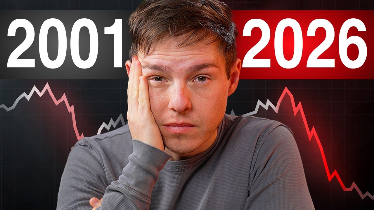
YouTube finance host Graham Stephan has used his latest video to walk viewers through what he calls 'the elusive stock market bubble', sitting with the side-by-side charts that compare 2026 with 1929, Japan in 1989 and the dot-com peak, and then arguing that the most likely path is still up and to the right rather than a crash.
Stephan opened with a borrowed framing from market commentator Peter Granditch.
"According to Peter Granditch, we are now in the parabolic meltup phase," Stephan said. "When and where it peaks is anyone's guess. It's also the exit phase, not enter. Just remember, it's better to be a year too early than a day too late."
The case for caution lines up against the headline indicators. Year-on-year, the S&P 500 is up another 30 per cent. The Schiller cyclically adjusted price-to-earnings ratio is sitting at its second-highest reading on record, only narrowly behind the dot-com bubble. Concentration peaks in the largest names are now comparable to 2001 tech and to the Japanese 'everything bubble' of the late 1980s. The top 10 stocks make up roughly 40 per cent of the entire S&P 500, exceeding the dot-com peak. And the Buffett indicator, the ratio of total market cap to GDP, sits 2.4 standard deviations above the historical trend.
Stephan also leant on Lance Roberts' checklist of structural fragility. "Decline in organic savings, check. Aging population drawing on benefits, check. Heavily indebted economy, check. Unemployment in young people, yep. Dependence on productivity increases to offset reduced employment, yep," Stephan ran through. The argument, as he framed it, is that the economy is being propped up by liquidity and that the fundamentals do not support current valuations.
Then Stephan turned the case on its head. He noted that the S&P's price-to-earnings forecast around 28 is roughly two-thirds higher than the long-run average of 17, but added that mega-cap earnings are 'remarkably strong' and that the Magnificent 7 cohort, on his read, are 'genuinely impressive companies'. He cited Fidelity's view that cash flows are exceeding income, net profits are running above the five-year average, and forward earnings remain below the 2001 peak. "Before, the average price to earnings peak was 65. Today, it's just 28," he said.
Drawing on Ben Carlson, Stephan suggested investors who anchor on 150-year averages may be reading the wrong dataset. "A better metric is just to look at the last 30 years when the internet was widely accepted," he said. Margins are improving. "Stocks are expensive, but they're making so much money that eventually they're going to be fairly priced as to what they make."
He also pushed back on the popular thesis that the rally is purely a dollar-debasement illusion. Citing Fisher Investments analysis going back to the 1970s, Stephan noted that the correlation between the trade-weighted dollar index and the S&P 500 sits at roughly 0.15, effectively zero, and that global stocks were up 76 per cent of the time whether the dollar was rising or falling.
For viewers wanting a checklist, Stephan re-published Fidelity's late-cycle warning signs: companies burning cash while spending more than they make; circular cross-ownership where one fall takes everything down; debt growing faster than profits; AI hitting an energy cap; and rising borrowing costs compressing earnings. None, in his read, are flashing red just yet.
Stephan's bottom line was a hedged base case rather than a crash call. "In order for us to see a repeat of what happened to Japan, earnings would have to stall out completely and the S&P 500 would need to rise to more than 14,000 for us to be at the same level. But as expensive as everything is, as it stands right now, it looks as though the stock market might continue getting even more expensive over time."
The video lands in the same week tastylive's Peter Boockvar told viewers the rally is 'siloed to anything touching AI', and as the equal-weighted S&P 500 RSP and the equal-weighted Nasdaq QQEW continue to lag the headline indices.